In its popular sense, composition is just the way different elements of a photograph are combined. But more specifically, as used by the photographer, composition refers to how the main subject is arranged in relation to other elements visible in the frame. Good composition will be pleasing to the eye, and it will enhance the subject. Let's look at some principles that you can apply to instantly improve your photography.
1. RULE OF THIRDS
The rule of thirds divides an image into three equal parts both vertically and horizontally. The idea is to position your main subject in the frame along these lines or where the lines intersect.
Study this image and my crude lines to see how the rule of thirds is used.
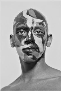
In this example we place our main subject in the center resulting in less a pleasing composition.
2. SYMMETRY & CENTERED COMPOSITION
This is the opposite of the rule of thirds where instead we center our main subject. By doing so we need to consider the importance of symmetry and balance.
In the case where your subject is in the center of the frame other objects can fill the space around it and bring harmony and symmetry to the composition.
3. LEADING LINES
When looking at a photo it is a natural tendency to follow lines. Lines can pull us into a picture, direct us toward our subject or right out of the picture.
Lines should direct us to our main subject.
Leading lines can be rails, as in the example above, walls, roads, railway tracks, or even patterns. Our focus is automatically drawn to the subject.
4. PATTERNS & REPETITION
Repetitive patterns give us a sense of harmony and rhythm and are aesthetically pleasing.
Rhythm creates order within the composition and emphasizes important elements. The inclusion of a pattern on the floor, ceiling or wall can ensure a pleasing composition.
Another technique is to break the rhythm in some way by including a focal point that breaks the repetitive pattern.
In the technical and mathematical sense, the "golden ratio" is just a number on the ratio of 1 to 1.618. But used by the photographer it can create a balanced and harmonious composition. The Golden Ratio is also called "natures number" because it appears throughout nature.
The Golden Spiral or Fibonacci spiral
The Phi Grid
The Phi Grid has a very similar design to the rule of thirds. However, rather than having nine equal sections, the lines on the Phi Grid are moved slightly towards the center to align with the Golden Ratio.
Position your subject at one of the spots where the lines meet. Also, important elements should fall along one of the vertical or horizontal lines.
Leading lines work well with the grid and add a dynamic element to the image.
Place the area with the most details in the smallest box of the coil.
Position the subject within the curve. This does not have to be in one of the corners. It can be anywhere in the frame.
In portrait photography the golden ratio can help draw attention to features of your model you want to highlight.
The intricate detail in a flower shows a good example of how the Fibonacci spiral is used.
Good composition in photography and art is a visual arrangement that is pleasing to the eye. Your most important goal in photography is to provide an aesthetic experience and to convey emotions, impressions, and thoughts. In the end good composition will emphasize your main subject, and subordinate's secondary ones.

.jpg)
.jpg)
.jpg)
.jpg)
.jpg)
.jpg)
.jpg)
.jpg)
.jpg)
.jpg)
.jpg)
.tif)
.jpg)
.jpg)
.jpg)
.jpg)
No comments:
Post a Comment